Art Museum Virtual Tour App
Case Study
(2022) This case study is for a virtual tour app that helps teachers create a virtual field trip itinerary. The project was inspired by working at a field trip destination during the COVID-19 pandemic and seeing the drastic decline in field trips to the facility. This case study was one of three projects for the Google UX Design Professional Certification completed in August 2022.

Problem
Budget cutbacks and COVID-19 have impacted the number of field trips students can experience in a year. For many students, especially in underserved communities, field trips are cut from the academic calendar when funds are limited.
Project Goal
Create an app which will allow teachers to create a digital field trip experience regardless of field trip budget.
Designer's Role
As this was a portfolio project for the Google UX Design Professional Certification course, I served in all roles to complete the app mock-up from start to finish. For this project, I was responsible for user research, paper and digital wire-framing, low and high-fidelity prototyping, accounting for accessibility, and iterating on designs.
Research
User Research
I created empathy maps to understand the users and identified a primary user group through research which are teachers planning field trips for their students.
This user group confirmed initial assumptions about who might use this app, but further research revealed other user groups who might benefit from the app like people who need assistive technology to experience art or navigate a museum. Other user problems included proximity and free time in accessing an art museum experience in person.
Key Challenges and Constraints
1
Budget
Main features need to be free and accessible to all user accounts
2
Time
User flow needs to be streamlined to help busy teachers save time during lesson planning
3
Sharing
Teachers want the ability to share and collaborate with other colleagues when planning field trips
4
Saving
Teachers want to work ahead and save multiple itineraries at a time to maximize lesson planning
Personas and User Journey Map
Target Audience: Teachers who regularly take students on art museum field trips impacted by budget cuts

.png)
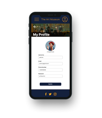
Design
App Wireframes
Taking the time to create the home screen as a paper wireframe allowed me to work out concerns before starting the digital mock up. I liked the idea of having a main carousel image at the top and easy to read buttons to start the navigation process.


App Low-Fidelity Mock Up
The low-fidelity prototype connected the primary user flow of browsing the gallery and adding art to an itinerary, allowing the prototype to be used in a usability study.

Usability Testing
Usability testing participants were all teachers currently teaching art or history classes and who regularly
(ie. at least once a year) take a group of 5 or more students to an art museum. The participant demographics were: two male, two female, and one nonbinary identifying individuals, between the ages of 20 and 65.
The research goal was to figure out if users are able to create an itinerary that fulfills their needs.
Research Questions
-
How long does it take for a user to create an itinerary with at least five art pieces?
-
How long does it take for a user to find a specific artist/art movement/art piece?
-
What parts of the app were most important and least important to creating their itinerary?
-
Are there any parts where users are getting stuck?
-
What can we learn from the steps users take to create an itinerary?
Major Findings
-
Adding art to the itinerary is difficult
-
Utilize overlays for confirmations
-
User flow was not direct
-
Users want a search feature
App Mock Ups
After the usability studies, the home screen was simplified even further by creating image buttons on a scrolling carousel at the top. I also revised the icons to be picture buttons to immerse the user more in a virtual space so the experience felt more like an in-person visit.
Before Usability Test
After Usability Test


App High-Fidelity Prototype
The final high-fidelity prototype presented users with a full experience of viewing a gallery of multiple art pieces while building an itinerary.

Conclusions
“If I had an app like this, it would make lesson planning so easy!”
- Usability study participant

Many users saw a real-world application for this service and would want to see more museums implement a virtual tour experience. While designing the art museum virtual tour app, I learned that the user flow isn’t necessarily linear. Usability studies showed how there are multiple paths a user can take and there needs to be flexibility in how a user moves forwards and backwards within the experience.
Next Steps
During user research, other potential features were identified but not pursued because they did not address the concerns outlined in the main user flow. With more time and resources, additional features could include:
1
Itinerary
Sharing
This was identified as a smaller pain point for teachers and could be added in a future round of updates. Teachers are looking for the ability to share itinerary links to other users.
2
Real-Time Collaboration
This was identified as a smaller pain point for teachers and could be added in a future round of updates. Teachers are looking for opportunities to work on the same itinerary as another user at the same time.
3
Student Engagement
Adding a student portal where students can follow along on the virtual tour, take quizzes, submit questions, and interact in real time would provide another way to improve the virtual field trip experience.